Bridging the gap between surplus food and the community that needs it.
The Headache:
The "Sustainability" Fear
Tasty Not Wasty does incredible work saving food from landfill. But a non-profit runs on two things: Funding and Manpower.
The Challenge: Their digital presence was invisible. People in need didn't know where to go. Potential donors couldn't easily give money, and willing volunteers didn't know how to sign up. The team was missing out on vital support simply because there was no easy way for the public to say "I want to help."
The Blockers
- ✗Invisible Digital Presence
- ✗Users in Crisis Couldn't Find Help
- ✗Complex Volunteer Signup
- ✗Barriers to Donation
The Soul:
Dignity First
"Help without the hoop-jumping." We sat down with the team and agreed on one core value: Dignity.
The Tone
We stripped away the corporate jargon. The website feels like a neighbor opening their door, not a government agency.
The Narrative
We highlighted the environmental mission (saving waste). This removes the stigma – users aren't just "taking charity"; they are "fighting food waste." It's a subtle shift that makes it easier for people to walk through the door.
The Fix:
The "Action Engine"
Turning passive visitors into active supporters. We built a platform that works two ways: it helps those in need, and it helps the charity grow.
One-Click Clarity
We prioritised the basics. Location and Opening Times are front and centre, ensuring people in crisis find answers instantly.
Volunteer Pipeline
We replaced the "awkward email inquiry" with a streamlined Volunteer Sign-Up flow. It captures the right details instantly, preventing admin headaches.
Frictionless Fundraising
We integrated a simple, clear Donation Pathway. By removing barriers, we turned the website into a 24/7 fundraising tool.
The "Low Friction" Mobile Experience
"We know you are on a phone, we know you are stressed, here is the answer." Access shouldn't be a struggle.
Zero Lag: We prioritised raw speed. No fading, no loading spinners. Just instant answers.
Thumb-Friendly: Large, clear touch targets designed for real-world usage on the go.
The "One-Hand" Test: Vital information is accessible with a single tap, right where the thumb naturally rests.
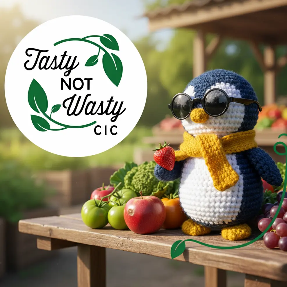
Tasty Not Wasty
Fighting food waste.
Feeding the community.
The Freedom
Less admin, more impact.
The volunteers used to spend hours answering basic questions and chasing potential helpers. Now, the rota fills itself. New applications land directly in the inbox, formatted and ready to go. The team can stop worrying about "finding people" and start focusing on feeding them. Discover how our automation services help non-profits stop worrying about admin and start focusing on impact.
The Verdict
"A vital tool for our community. It connects us with the people who need help, and the people who want to help them."– Source
The Tech Specs
(The "Low Data" Approach)
# Core Architecture
Type: Static HTML5 (Lightweight)
Purpose: Zero-latency access for users in crisis

# Accessibility & Inclusion
Compliance: WCAG 2.1 AA Compliant
Contrast: High Contrast Mode for visibility
Network: Optimised for 3G connections and older smartphones

# Performance Stats
Page_Weight: < 100kb
Interactive_Elements: Alpine.js (No heavy frameworks)
Load_Time: Instant